Registration Forms
Registration Forms let you build the sign-up experience new players see on your casino brands. Assemble multi-step forms from a fixed set of player fields, set each field's labels and rules, and control how the registration page looks. A well-designed form captures the details you need to open an account while keeping sign-up quick.
Accessing Registration Forms
- Open Communications > Registration Forms in the sidebar
- The registration forms list opens with summary cards above it
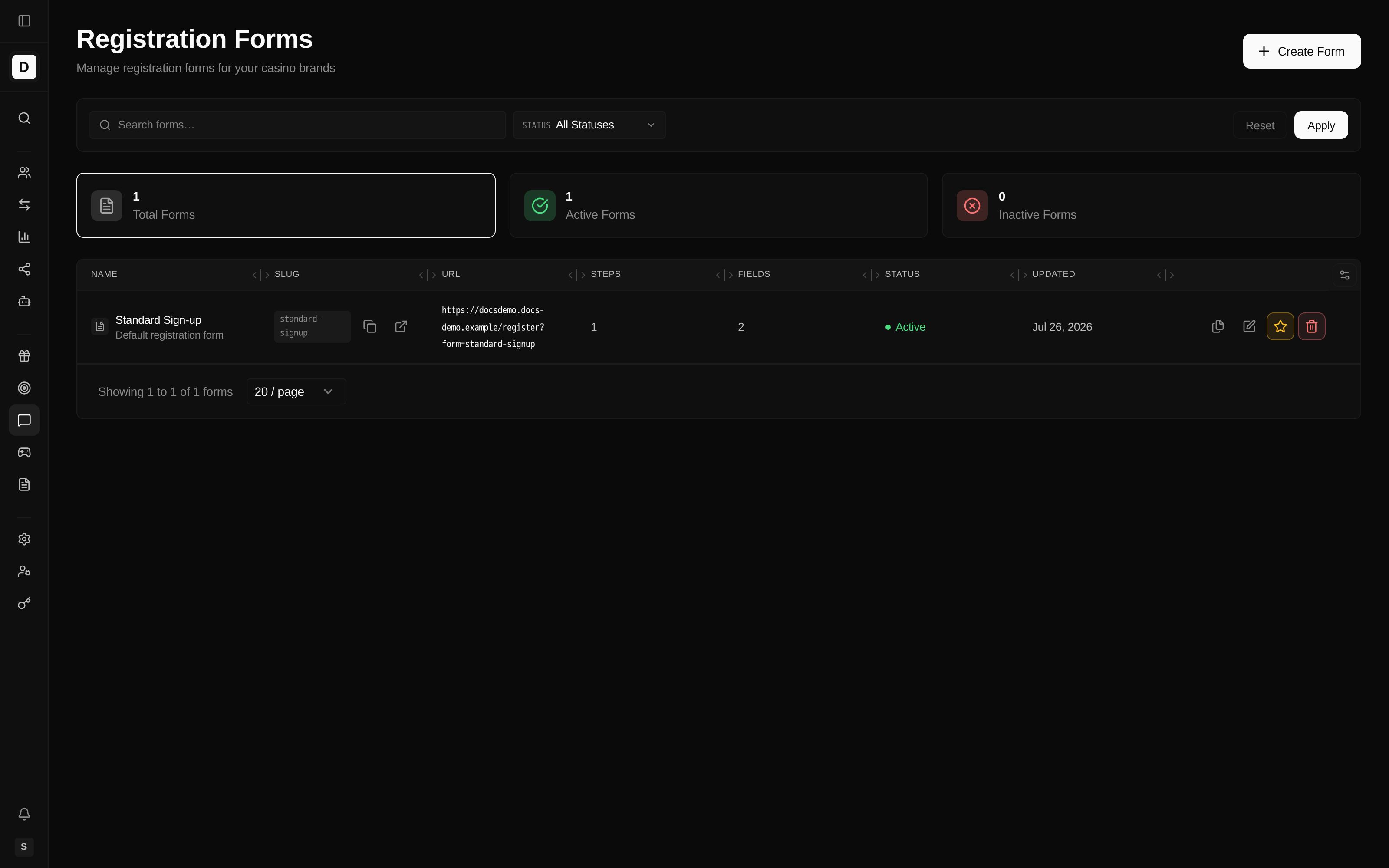
Summary Cards
| Card | Description |
|---|---|
| Total Forms | Number of form configurations |
| Active Forms | Forms currently enabled |
| Inactive Forms | Forms currently disabled |
Registration Form List Columns
| Column | Description |
|---|---|
| Name | Form name; the default form is labelled "Default registration form" beneath its name |
| Slug | Short identifier used in the web address (URL), with buttons to copy or open the public link |
| URL | The public registration link for that form |
| Steps | Number of steps in the form |
| Fields | Total number of fields across all steps |
| Status | Active or Inactive — click to toggle the form on or off |
| Updated | Date the form was last changed |
| Actions | Duplicate, Edit, Set as Default, and Delete |
Filtering Forms
- Search — search by name or slug
- Status — filter by All Statuses, Active, or Inactive
Click Apply to run the filters or Reset to clear them.
Creating a Registration Form
Create a form so new players complete a sign-up flow tailored to your brand.
- Click the Create Form button
- Fill in the basic details:
- Form Name — display name (e.g. "Standard Registration")
- Slug — identifier for the web address (auto-generated from the name)
- Description — internal notes (optional)
- Redirect URL — where to send the player after registration
- Set as Default — use this as the primary registration form
- Click Create
This creates an empty form. Use the Form Builder to add steps and fields.
Form Builder
Click Edit on a form to open the visual Form Builder.
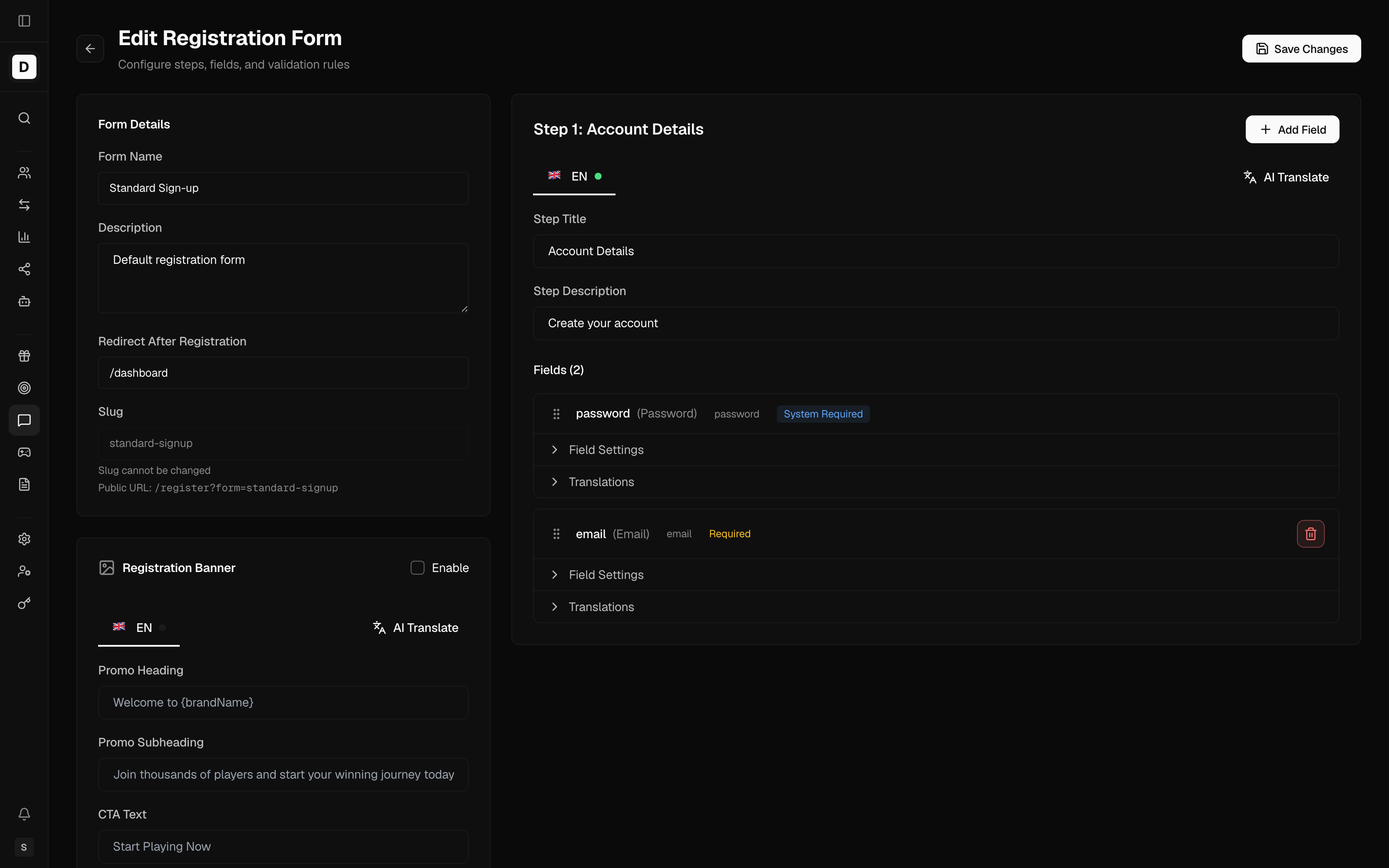
Builder Interface
- Left panel — the available player fields you can add to a step
- Centre — the form's steps and the fields inside each
- Right panel — settings for the selected field
Adding Steps
Splitting a longer form into steps keeps each screen short.
- Click the Add Step button
- Name the step (e.g. "Personal Info", "Contact Details")
- Add fields to the step from the available player fields
- Drag fields to reorder them within the step
Available Fields
You build each step from a fixed set of predefined player fields. Each field captures a specific detail of the player's account. Dragging reorders fields within a step.
| Field | Captures |
|---|---|
| Player email address | |
| Password | Account password |
| First Name | First name |
| Last Name | Last name |
| Date of Birth | Date of birth |
| Phone | Phone number |
| Country | Country |
| Currency | Currency |
| City | City |
| Address | Address |
| Postal Code | Postal / zip code |
| State | State / province / region |
| Gender | Gender |
| Promo Code | Promotional code |
| Referral Code | Referral code |
| Welcome Offer | The welcome offer the player selects at sign-up |
| Username | Player-chosen username login identifier |
| Accept Terms | Terms & conditions acceptance (checkbox) |
| Accept Marketing | Marketing consent (checkbox) |
Some fields are always required — the details needed to open an account. These show a "system required" note, stay switched on, and cannot be removed once added.
Field Settings
Select a field to configure:
| Setting | Description |
|---|---|
| Label | The field's on-screen label |
| Default Placeholder | Hint text shown inside the input |
| Default Help Text | Extra guidance shown with the field |
| Required field | Whether the field is mandatory (locked on for system-required fields) |
| Sort Order | Position of the field within its step |
The Accept Terms and Accept Marketing checkboxes add an Auto-accept option that pre-checks the box for the player.
Country, Currency & Phone Options
The Country, Currency, and Phone fields have extra, jurisdiction-relevant settings:
A One-Time Password (OTP) is a single-use code that confirms an action.
| Option | Applies to | Description |
|---|---|---|
| Availability (show-for / hide-for) | Country, Currency | Restrict the choices to a list — either only the listed countries/currencies (show for) or all except them (hide for). An empty list means all of the brand's countries/currencies. |
| Auto-select from country | Currency | Pre-select the currency based on the chosen country |
| Hide field on registration form | Country, Currency | Keep the field in the form data but not shown to the player |
| Show search input | Country, Currency, Phone | Show a search box inside the selector for long lists |
| Require SMS verification (OTP) | Phone | Players must verify their number with a 6-digit code sent by SMS before the account is created (available only when the phone field is required) |
The Country and Currency choices are drawn from the brand's configured countries and currencies, so they stay consistent with the brand's jurisdiction setup.
Form-Level Settings
Beyond the steps and fields, a registration form has presentation and behaviour settings:
- Banner — a side banner shown next to the form: desktop and mobile images, background/text colours, position (left or right), optional gradients, and localised heading, subheading, and call-to-action (CTA) text
- Page layout — the registration page's chrome: sidebar state (expanded / collapsed / hidden) and whether the logo is shown on desktop and mobile
- Abandon confirmation — an optional prompt when a player tries to leave a partly completed form (a browser prompt and/or a custom message with a localised title and body)
Validation
Field formats are checked automatically based on the field type — for example an email field requires a valid email address, and the password field enforces a minimum length. The phone field can additionally require SMS verification (see the Phone options above).
Form Actions
Setting as Default
The default form is served whenever no specific form is requested, so it should be your main sign-up flow.
- Click the Set as Default (star) action
- Confirm the change
Only one form can be default at a time, and the default form's star is shown filled.
Duplicating a Form
- Click the Duplicate action
- In the dialog, enter a new Name and Slug for the copy
- Click Create copy
- Edit the copy as needed
The name and slug you provide are used as-is; no "-copy" suffix is added automatically. Useful for creating variations without starting from scratch.
Activating / Deactivating
- Click the Status dot, or the Activate / Deactivate action
- The status changes immediately
Inactive forms are not shown to players.
Deleting a Form
- Click the Delete action
- Confirm deletion
The default form cannot be deleted. Set another form as default first.
Preview
In the Form Builder, click Preview to:
- See the form as players will
- Test field interactions
- Check the mobile appearance
Example Form Structure
An illustrative three-step form built from the available fields:
Step 1 — Account
- Email (required)
- Password (required)
Step 2 — Personal
- First Name (required)
- Last Name (required)
- Date of Birth (required)
- Country (required)
Step 3 — Preferences
- Currency (required)
- Accept Terms (required)
- Accept Marketing (optional)
Best Practices
- Keep forms as short as possible
- Use multiple steps for longer forms (3–5 steps)
- Put the most important fields first
- Mark optional fields clearly
- Provide clear help text
- Check the form on mobile devices
- Include the required legal checkboxes
- Set a sensible redirect after registration
Legal Requirements
Make sure your forms include:
- Terms & Conditions acceptance
- Marketing consent (for General Data Protection Regulation, GDPR, compliance)
- The date-of-birth and identity details your jurisdiction requires for age and eligibility checks
Testing Form Variations
To compare sign-up flows:
- Create variation forms
- Point different links or audiences at each
- Compare completion rates
- Set the best performer as default