Carousels
Carousels are rotating banner displays shown on your casino website to showcase promotions, games, and announcements in a single prominent slot. This guide covers creating and managing carousels.
Accessing Carousels
- Open Content > Carousels in the sidebar.
- The carousel list opens with summary cards above it.
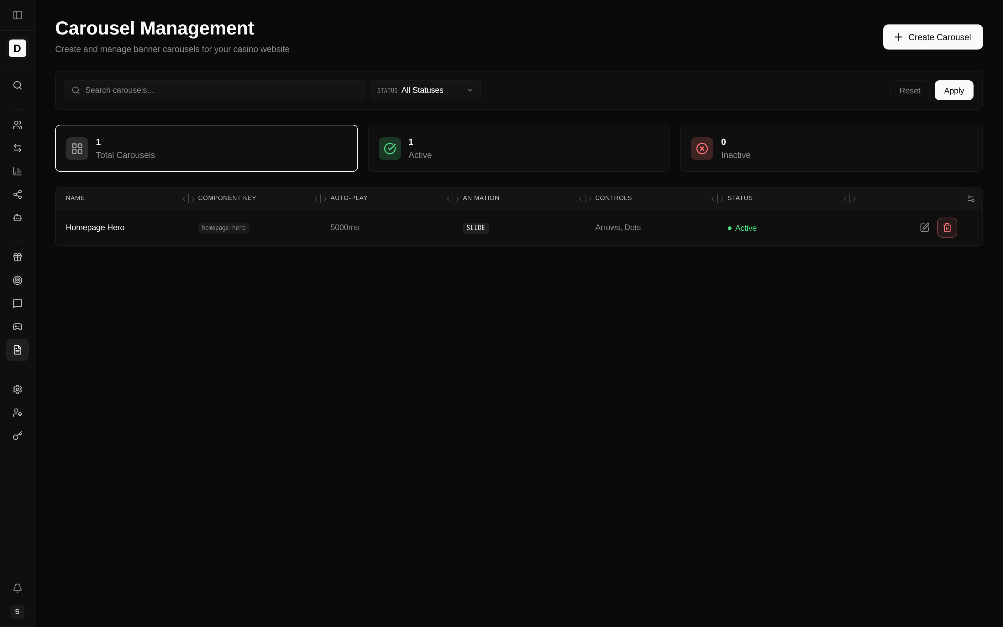
Summary Cards
Three cards sit above the list. Each is clickable — selecting one filters the list to that status.
| Card | Description |
|---|---|
| Total Carousels | Number of carousels for the selected brand |
| Active | Carousels currently enabled |
| Inactive | Carousels currently disabled |
Carousel List Columns
| Column | Description |
|---|---|
| Name | Carousel name, with its description shown beneath (if set) |
| Component key | Internal identifier used to place the carousel in your site layout — not a public web address |
| Auto-play | Rotation interval in milliseconds, or "Off" |
| Animation | Transition style (Slide) |
| Controls | Which navigation controls are shown (Arrows, Dots) |
| Status | Active or Inactive |
Each row ends with Edit and Delete actions.
Filtering Carousels
- Search — search by name or component key.
- Status — filter by Active or Inactive (or All Statuses).
Set your filters and click Apply, or Reset to clear them.
Creating a Carousel
Create a carousel to group several banners into one rotating display for your site.
- Click Create Carousel.
- Configure the carousel across the tabbed form.
- Click Save.
General Tab
- Carousel Name — the display name.
- Slug — the component key used to place the carousel in your site layout. It is suggested automatically from the name and can be edited. This is an internal identifier, not a public web address.
- Description — internal notes (optional).
- Active — when enabled, the carousel is visible on your website.
Display Tab
- Show navigation arrows — display left/right arrows.
- Show dot indicators — display position dots.
- Banners per slide — how many banners appear side-by-side at each screen size (see Responsive Banners per Slide).
- Height (optional) — a manual height in pixels per screen size. By default the carousel height follows the image proportions; setting a manual height may crop the images. Set this per screen size only if you need a fixed height.
Behavior Tab
- Enable auto-play — banners rotate automatically.
- Auto-play Interval (ms) — time between rotations, from 3000 to 15000 ms (default 5000).
- Pause on hover — stop rotation while the pointer is over the carousel.
- Animation Style — the transition style. Slide is available.
Banners Tab
- Available Banners — click Add to include a banner.
- Assigned Banners — the banners in this carousel, numbered in rotation order.
- Reorder with the up/down arrows on each assigned banner; remove one with its remove icon.
The tab label shows the number of assigned banners, e.g. Banners (3).
Carousel Configuration Options
Auto-play Settings
| Setting | Description | Recommended |
|---|---|---|
| Enable auto-play | Banners rotate automatically | Yes |
| Auto-play Interval | Time per slide, 3000–15000 ms | 5000–8000 ms |
| Pause on hover | Stop while the pointer hovers | Yes |
Navigation Controls
| Setting | Description | Use Case |
|---|---|---|
| Arrows | Left/right navigation | Desktop users |
| Dots | Position indicators | Mobile users |
Animation Styles
- Slide — horizontal sliding transition.
Responsive Banners per Slide
A carousel can show more than one banner at a time, and the count adapts to screen size. Set a separate value for each screen size:
| Screen size | Default banners per slide |
|---|---|
| Mobile (under 768 px) | 1 |
| Tablet (768–1023 px) | 2 |
| Desktop (1024–1279 px) | 3 |
| Large desktop (1280–1535 px) | 3 |
| Extra large (1536 px and up) | 3 |
Use 1 per slide for a classic single-banner hero, or higher values to show a row of promo cards
that rotates together.
Managing Banners in a Carousel
Adding Banners
- Edit the carousel.
- Open the Banners tab.
- Under Available Banners, click Add on each banner you want to include.
Reordering Banners
- Open the Banners tab.
- Use the up/down arrows on each assigned banner to change its position.
- The banner numbered
#1shows first in rotation.
Removing Banners
- Open the Banners tab.
- Click the remove icon on the banner.
- The banner leaves this carousel (the banner itself is not deleted).
Placing a Carousel on Your Site
Each carousel is referenced by its component key when building your site's page layout. The key
is an internal identifier, not a public web address. For example, a carousel with the component key
homepage-hero can be placed in the homepage layout above the fold.
Common carousel placements:
- Homepage hero section
- Category pages
- Promotion sections
- Game lobbies
Best Practices
- Keep carousels to 3–5 banners for best engagement.
- Use consistent banner dimensions.
- Set reasonable auto-play intervals (5000–8000 ms).
- Keep pause on hover enabled.
- Test on mobile devices.
- Rotate promotional content regularly.
- Use descriptive component keys for easy identification.
Banner Requirements
For best results, ensure banners meet these requirements:
- Consistent dimensions across all banners.
- Optimized file sizes for fast loading.
- A clear, visible call to action.
- Mobile-responsive design.